Hello, I would like to suggest some things to improve the use of DEX.
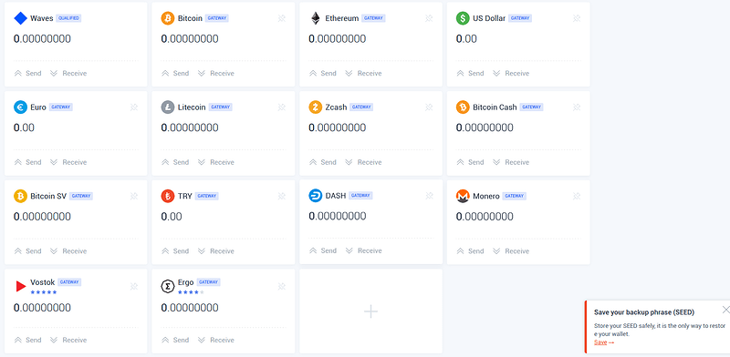
1- In the wallet, I would like to suggest that all qualified cryptocurrencies already listed (at least the ones I already own) appear without having to click + to appear.
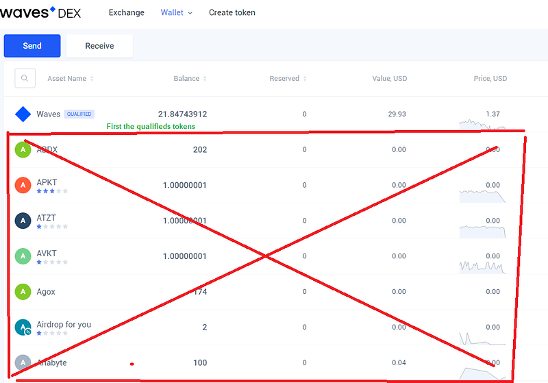
2- In the wallet, in the ‘send’ option, first list the qualified tokens and then the others to avoid a huge listing with several spam tokens that generally do not interest us.
3- In ‘wallet> portfolio’ also list, first, the qualified tokens, and then the others (by default, in ‘all active’).
I think these little tips would make our everyday use easier.
Thanks!


