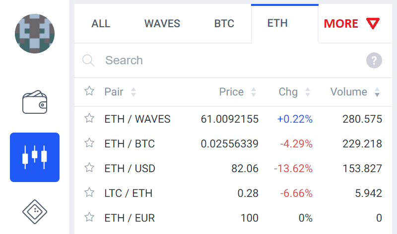
For new users the arrow next to ETH is not much visible. I suggest to add the word “More” (or something similar) with the arrow.
For new users the arrow next to ETH is not much visible. I suggest to add the word “More” (or something similar) with the arrow.